Styling with CSS
This guide applies to:
- Basic
- Professional
In this guide
Introduction
In this nifty guide, we’ll go over tips on styling with CSS that will allow you to tailor your interactive images more to your liking.
We’ll be going over:
- Changing Image Size in Left/Right Layout
- Hover Tooltips
- Hide the Tooltips
- Changing Content, Title, Thumbnails
- Preventing Cut-Offs in Tooltips
- Switch Thumb (Detail Image) and Content
- Make the Image Area Background Transparent
- Adjusting the Lightbox
You can add custom CSS to your theme or child theme’s CSS file. If you’re not comfortable with editing that, we have some recommendations. Here are some popular ways to add CSS:
- Adding Custom CSS to your theme’s Additional CSS
- Jetpack’s Custom CSS module
- Simple Custom CSS plugin
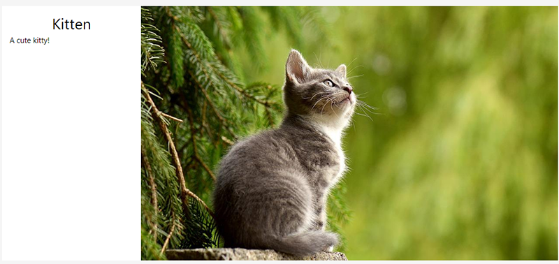
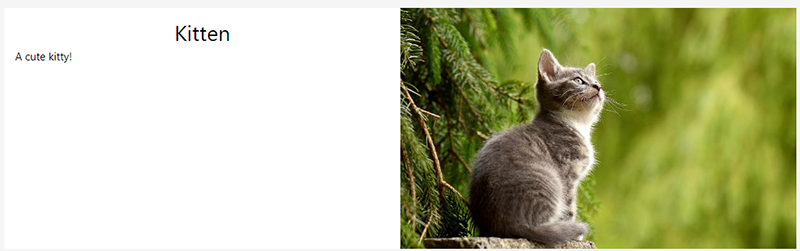
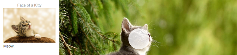
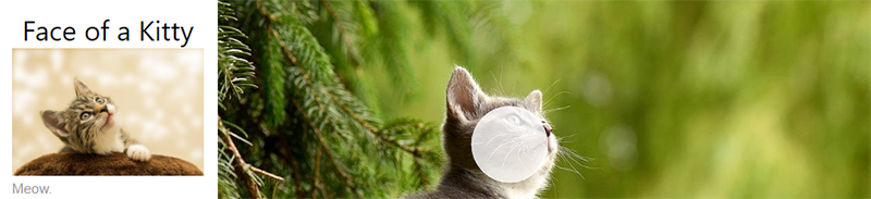
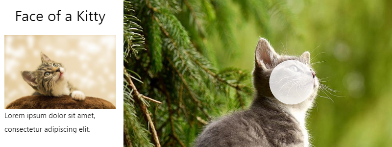
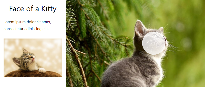
Changing Image size in Left/Right Layout
To change the interactive image’s size when using the Left or Right Layout, use the following CSS snippets and adjust the percentages to your liking.
Where {ID} is replaced with the ID of your interactive image.
@media (min-width: 900px) {

#hotspot-{ID}.layout-left .hotspots-image-container,
#hotspot-{ID}.layout-right .hotspots-image-container {
-webkit-flex: 0 0 50%;
flex: 0 0 50%;
}

#hotspot-{ID}.layout-left .hotspots-placeholder,
#hotspot-{ID}.layout-right .hotspots-placeholder {
-webkit-flex: 0 0 50%;
flex: 0 0 50%;
max-width: 50%;
}
}
Before CSS:
After CSS:
The image will only grow as big as the upload size. If the image is small to begin with, nothing can stretch it. We recommend using a bigger image.
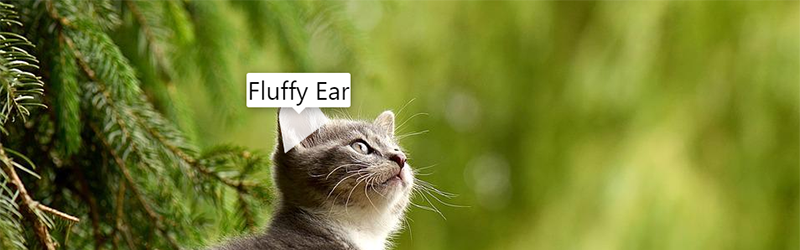
Hover Tooltips
Adjusting the size of the tooltip can cause layout issues, especially on devices with smaller screens such as mobile phones and tablets. Please test thoroughly in several different browsers and at several different screen sizes to ensure that the tooltips are visible and working as expected after adjusting the size.
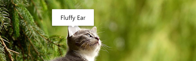
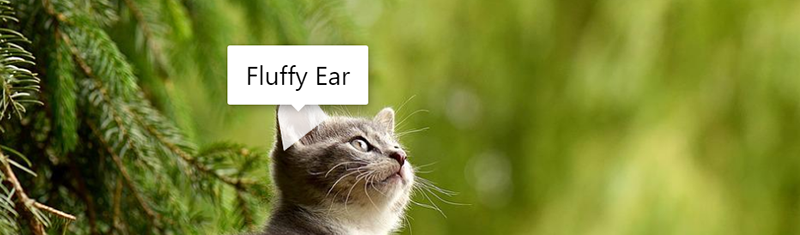
Adjusting the Padding
If you’d like more or less space between the content and the edge of the tooltip, you can adjust the margins to get the desired effect.
body .leaflet-rrose-content {
	margin: 14px 20px;
}
To adjust the padding for one interactive image, use this CSS:
#hotspot-{ID} .leaflet-rrose-content {
	margin: 5px 5px;
}
The {ID} should be replaced with the ID of your Draw Attention image. For example, if the ID is 123, the code would be:
#hotspot-123 .leaflet-rrose-content {
	margin: 5px 5px;
}
Before:
After:
Adjusting the Width
We recommend using a media query to specify the screen sizes to which your width adjustments will apply to help ensure the tooltips on devices with small screens continue to work as expected. To globally adjust the tooltip width on all tooltips on all Draw Attention images on the site, use this CSS:
@media screen and (min-width:768px) {
	body .leaflet-rrose-content[style] {
		width: 100px !important;
	}
}
Please note that the !important is required to override inline styles that are applied automatically to the tooltip via JavaScript.
To adjust the width for tooltips on just one interactive image, use this CSS:
@media screen and (min-width:768px)
	#hotspot-{ID} .leaflet-rrose-content[style] {
		width: 100px !important;
	}
}
The {ID} should be replaced with the ID of your Draw Attention image. For example, if the ID is 123, the code would be:
@media screen and (min-width:768px)
	#hotspot-123 .leaflet-rrose-content[style] {
		width: 100px !important;
	}
}
Before:
After:
Adjusting the Height
We recommend using a media query to specify the screen sizes to which your height adjustments will apply to help ensure the tooltips on devices with small screens continue to work as expected. To globally adjust the tooltip height on all tooltips on all Draw Attention images on the site, use this CSS:
@media screen and (min-width:768px) {
	body .leaflet-rrose-content[style] {
		height: 200px !important;
	}
}
Please note that the !important is required to override inline styles that are applied automatically to the tooltip via JavaScript.
To adjust the height for tooltips on just one interactive image, use this CSS:
@media screen and (min-width:768px)
	#hotspot-{ID} .leaflet-rrose-content[style] {
		height: 200px !important;
	}
}
The {ID} should be replaced with the ID of your Draw Attention image. For example, if the ID is 123, the code would be:
@media screen and (min-width:768px)
	#hotspot-123 .leaflet-rrose-content[style] {
		height: 200px !important;
	}
}
Before:
After:

If you find that you need more space, we recommend using the lightbox layout rather than the tooltip layout, as tooltips are intended to be simple, short, and limited in size.
Hide the Tooltips
If you would prefer to hide the tooltips, you may use the following CSS:
body .leaflet-pane.leaflet-tooltip-pane {
	display: none;
}
Changing Content, Title, Thumbnails
Styling with CSS with the provided snippets will affect all of the hotspots. At the moment, we don’t have a way to target specific hotspots.
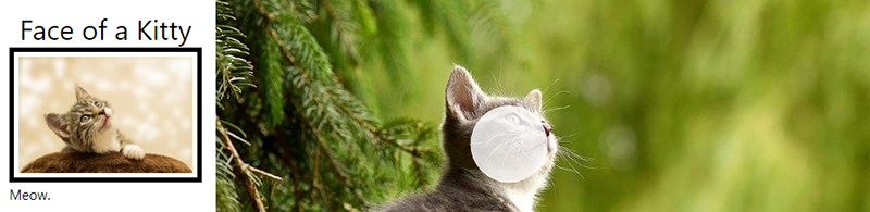
Change Title Styling
To change the styles for the title, use this CSS and add to or tweak it to your preferences:
.hotspot-info .hotspot-title {
font-family: sans-serif;
font-size: 1rem;
font-weight: normal;
color: #999 !important;
}
Before:
After:
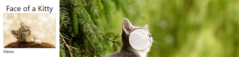
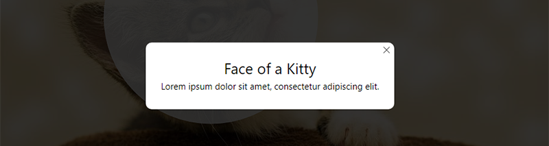
Change Content Styling
To change the content styling, use this CSS:
.hotspot-info .hotspot-content {
font-family: sans-serif;
font-size: 1rem;
font-weight: normal;
color: #999 !important;
}
After:
Change Content Styling
To change the styling for the thumbnail/detail image, use this CSS:
.hotspot-info .hotspot-thumb img{
border: 5px solid #000;
padding: 5px;
}
After:
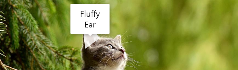
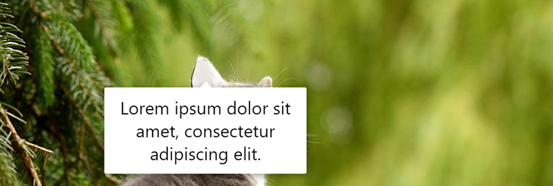
Preventing Cut-Off in Tooltips
Tooltips are meant to hold just a few words. But, we do have a CSS snippet that can help with wrapping the words. This way, you won’t see the tooltips being cut off when using a longer title.
Change Hover Tooltip Title Styling
.leaflet-tooltip {
padding: 1em;
width: 10vw!important;
word-break: break-word !important;
white-space: pre-line !important;
overflow-wrap: break-word !important;
-ms-word-break: break-word !important;
word-break: break-word !important;
-ms-hyphens: auto !important;
-moz-hyphens: auto !important;
-webkit-hyphens: auto !important;
hyphens: auto !important;
}
Switch Thumb (Detail Image) and Content in Hotspots
If you would like to switch the order in which the thumbnail (detail image) and content appear, we have just the CSS snippets for this.
This CSS snippet works across all layouts in both the free and professional editions of Draw Attention.
.hotspots-container .hotspots-placeholder .hotspot-info.visible,
.leaflet-rrose-content-wrapper .leaflet-rrose-content,
.featherlight-content .hotspot-info.da-hidden {
display: flex;
flex-flow: column;
}

.hotspot-title {order:1;}
.hotspot-content{order:2;}
.hotspot-thumb {order:3;}
Before:
After:
Make the Image Area Background Transparent
You’ll need to know the ID of your image; this is the same ID used to embed the image with the shortcode.
The CSS to do this is:
body #hotspot-{ID} .leaflet-container,
body #hotspot-{ID} .hotspots-image-container {
	background: transparent;
}
The {ID} should be replaced with the ID of your Draw Attention image. For example, if the ID is 123, the code would be:
body #hotspot-123 .leaflet-container,
body #hotspot-123 .hotspots-image-container {
background: transparent;
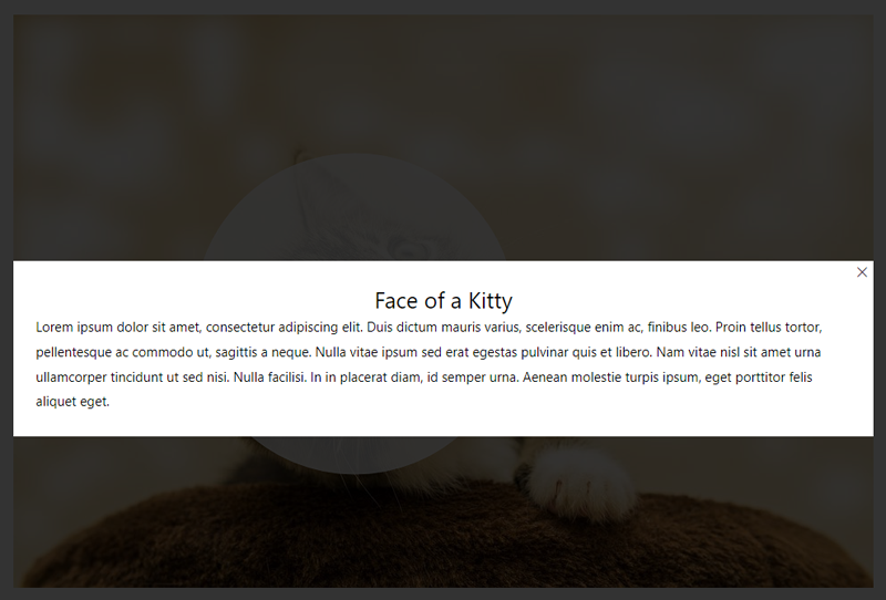
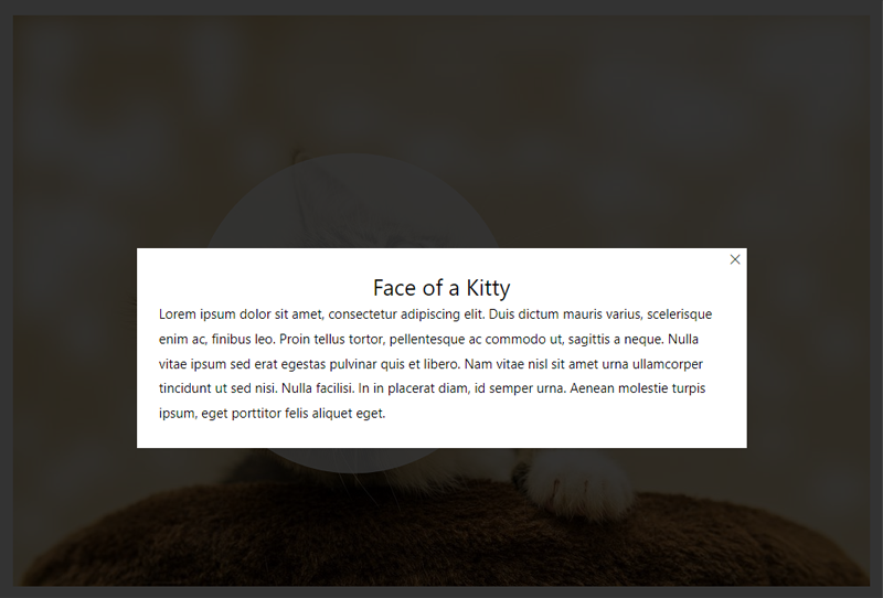
}Adjusting the Lightbox
Change the Width
If you’re using the lightbox layout, you may want to make the lightbox smaller or larger. Here is the CSS that you can use to change the width:
body .featherlight .featherlight-content {
	max-width: 50%;
}
Where the max-width is the maximum size you’d like the lightbox to be.
Keep in mind that our plugin is responsive, so you may want to use media queries to set a larger percentage on smaller screens, like so:
body .featherlight .featherlight-content {
max-width: 90%;
}
@media screen and (min-width:600px) {
body .featherlight .featherlight-content {
max-width: 75%;
}
}@media screen and (min-width:980px) {
body .featherlight .featherlight-content {
max-width: 50%;
}
}Before:
After:
Add Rounded Corners
To add rounded corners to all Draw Attention lightboxes, use this CSS:
body .featherlight .featherlight-content {
	border-radius: 10px;
}
And, if you need to add rounded corners to the lightbox for a specific image only, you’ll need to include the image ID in the CSS selector like so:
body .featherlight .featherlight-content.lightbox-{id} {
	border-radius: 10px;
}
The {ID} should be replaced with the ID of your Draw Attention image. For example, if the ID is 123, the code would be:
body .featherlight .featherlight-content.lightbox-123 {
	border-radius: 10px;
}
If you’re looking to display bigger thumbnail images and customize your interactive image with some PHP, please take a look at our Customizing with PHP guide.