Interactive Image Editor
In this guide
Introduction
Let’s start diving into the details of the interactive image editor and how it works. At the basic level, you’ll be able to:
- Create an interactive image
- Add hotspots to the interactive image
- Customize the appearance of the hotspots
- Customize the interactive image layout
General Settings
Within the Interactive Image Editor, the General Settings allow you to modify the background of the interactive image and information area, as well as the text color. In this section, you’re also able to enter in text that will show up by default in the hotspot content area upon loading the page.
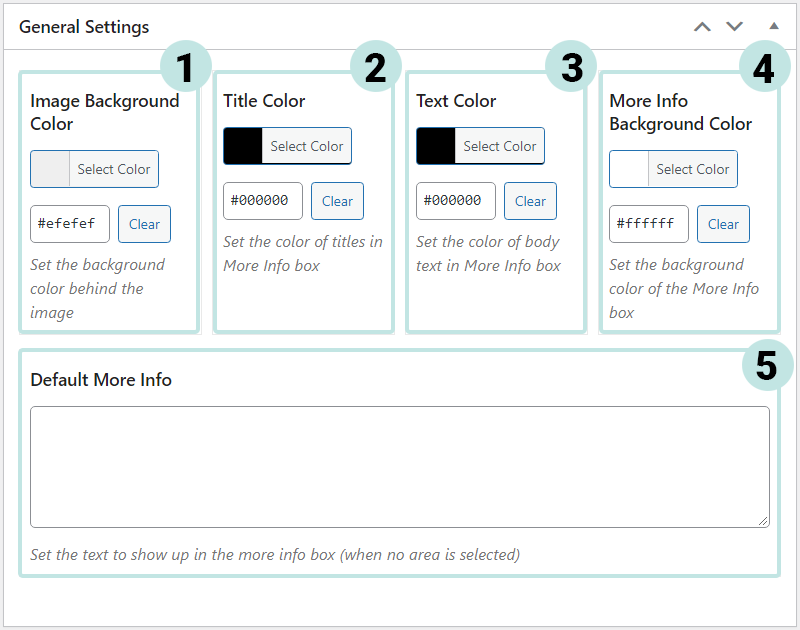
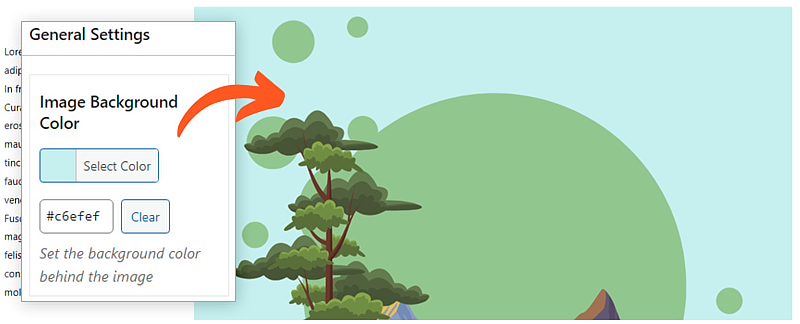
1. Image Background Color
This will change the interactive image’s background color, especially if the image has a transparent background.
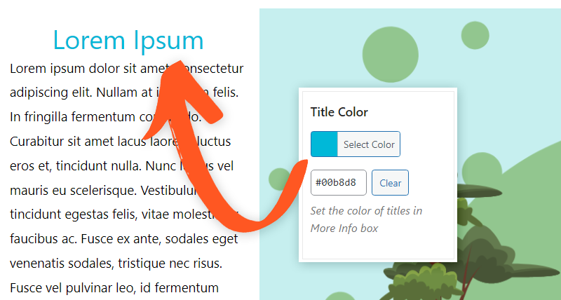
2. Title Color
This will change the interactive image’s title color for the more info area.
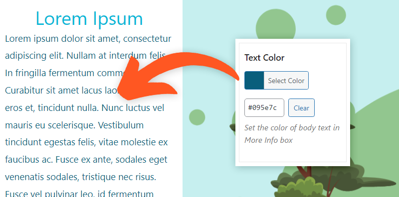
3. Text Color
The Text Color can be customized using this setting; this is the text that appears in the default more info and hotspot more info area.
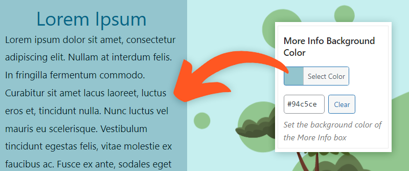
4. More Info Background Color
The background color of the more info area can be tweaked to your liking!
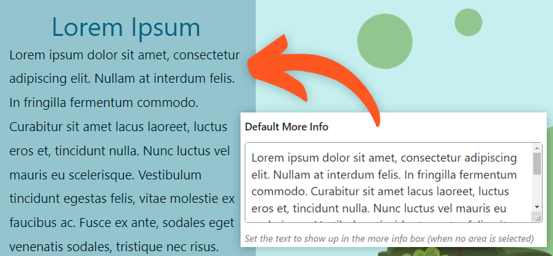
5. Default More Info
Interested in writing out some default text? Feel free to do so to your heart’s content. This particular text appears upon page load before a hotspot is even selected, so this is fantastic for providing some extra nifty information.
Image
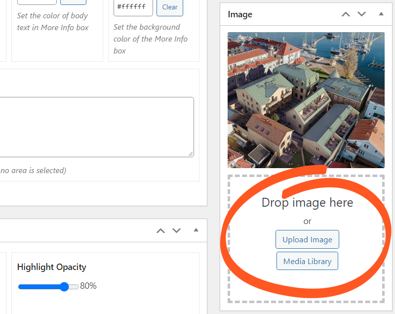
This section is where you will be choosing your image from, whether you are uploading it or selecting from your media library.
We would like to note that at this time, .SVG file types are not supported as it creates a conflict with the hotspots’ functionality.
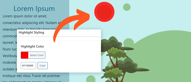
Highlight Styling
The Highlight Styling section grants you the ability to customize and tweak the color and opacity of the hotspot’s highlight and border. Let’s go over these sections.
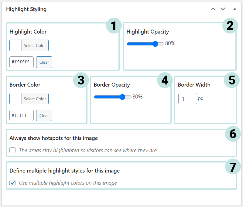
1. Highlight Color
The hotspot’s Highlight Color can be adjusted to that of your liking using the Select Color button to select a color from the wheel, or a hex code you have in mind.
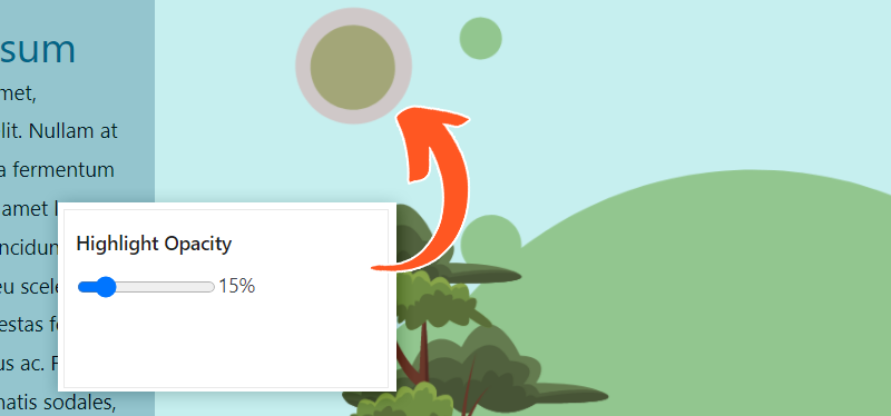
2. Highlight Opacity
The Highlight Opacity can be adjusted, controlling the transparency of the highlight.
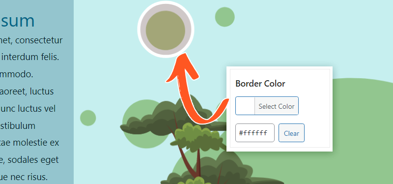
3. Border Color
The hotspot’s Border Color can be edited using the Select Color button or by entering a hex code.
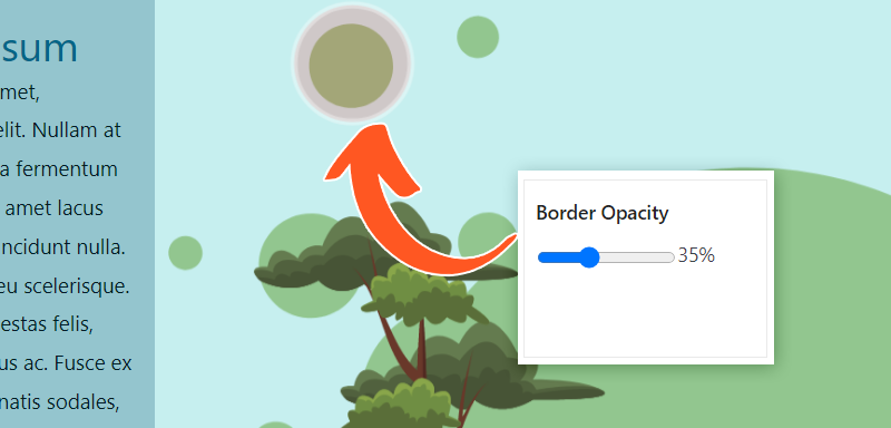
4. Border Opacity
The Opacity can be adjusted to appear more solid or transparent.
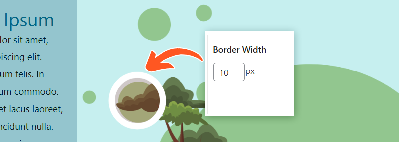
5. Border Width
The Border Width of the highlight can be increased or decreased to appear nonexistent, thin, or thick.
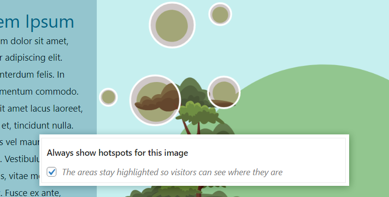
6. Always show hotspots for this image
The hotspot areas stay highlighted so visitors can see where they are located, even when they aren’t clicked yet.
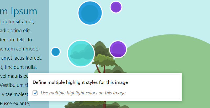
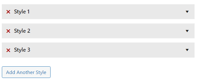
7. Define multiple highlight styles for this image
You can use multiple highlight colors for the interactive image. If you choose to define multiple highlight styles, another section will pop up called, “Styles”.
Styles – Define multiple highlight styles for this image
Within the optional ‘Styles’ category, you can name the style so it’s easier to discern which style is what when assigning them to your hotspots. And, as expected, you can customize the highlight style like above! Let’s go over this real quick.
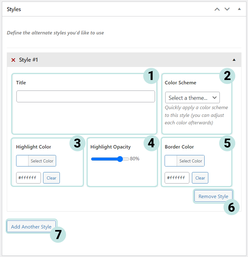
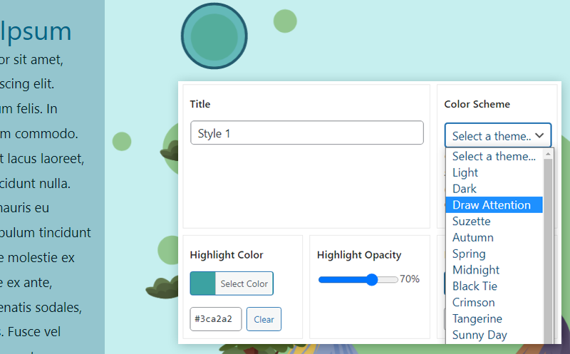
1. Title
A title can be assigned to the Highlight Style so that you are able to discern which is which.
The title is converted into CSS classes and must use only CSS-supported characters. Including [a-z], [0-9], hyphens and underscores. No special characters.
2. Color Scheme
If you would like to start off with a nifty preset color scheme and work your way from there, then this is the best place to start.
3. Highlight Color
The highlight color of the hotspot can be adjusted to your liking.
4. Highlight Opacity
This controls the transparency of the hotspot’s highlight.
5. Border Color
The border color can be tweaked for the highlight.
6. Remove Style
If you would like to just do away with the style, feel free to remove it.
Any hotspots using the removed style will automatically revert to the Default style.
7. Add Another Style
And if you’re feeling extra spicy, you can add and customize more styles!
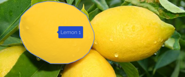
Hotspot Areas
The Hotspot Areas is where the magic happens. Hotspots can be created via shapes that are assigned to coordinates. With the new and improved drawing tools, you will also be able to zoom in and pan the image with ease when creating hotspots, allowing you to hand draw a section of the image your site visitors can select.
Please take a look at our guide on how to create your hotspots.
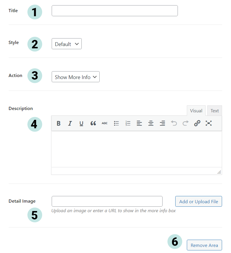
1. Title
A title can be assigned to your hotspot, which will appear within the more information area.
The title will also be displayed within the small tooltips seen when hovering over the image hotspots. This is a default feature but can be hidden with CSS.
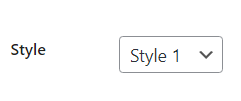
2. Style
A style can be assigned to the hotspot, which can be handy for creating a sold vs available interactive image.
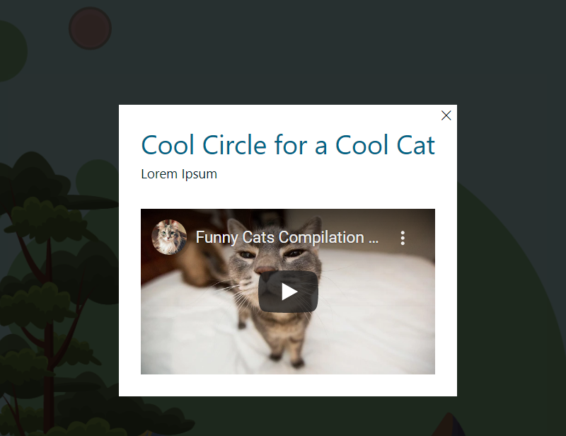
3. Actions
Actions occur when a user interacts directly with the image. Upon clicking a hotspot, the hotspot can either:
- Display more information
- Or, Redirect to another URL.
4. Description
The description of the hotspot will appear below the title in the more information section. This uses a visual and text editor, so you are free to format the text as necessary. Additionally, you can insert shortcodes, videos, images, or HTML.
5. Detail Image
A detail image can be added via uploading or by URL to display an image within the more information section of the interactive image.
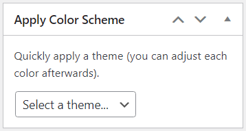
Color Scheme
Within the sidebar on the right-hand side of the interactive image editor, the Apply Color Scheme section allows you to quickly apply a theme to save on time. The best part is that you are still free to customize the colors as you please! At this time, there are twenty color schemes to pick from.
Layout
Now the fun part–determining how to display your interactive image. We have a couple of neat choices here, so let’s dive into what each do.
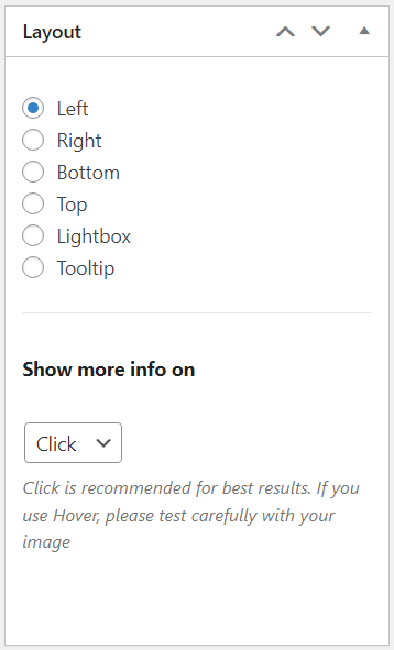
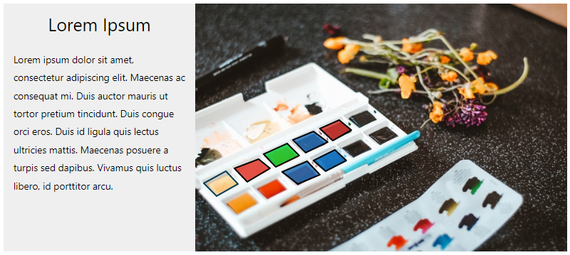
Left
The hotspot’s Title and More Information box will display on the left-hand side of the Draw Attention image.
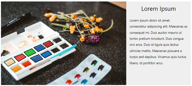
Right
The hotspot’s Title and More Information box will display on the right-hand side of the Draw Attention image.
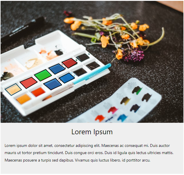
Bottom
The hotspot’s Title and More Information box will display right below the Draw Attention image.
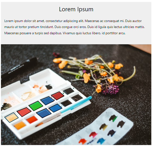
Top
The hotspot’s Title and More Information box will display above the Draw Attention image.
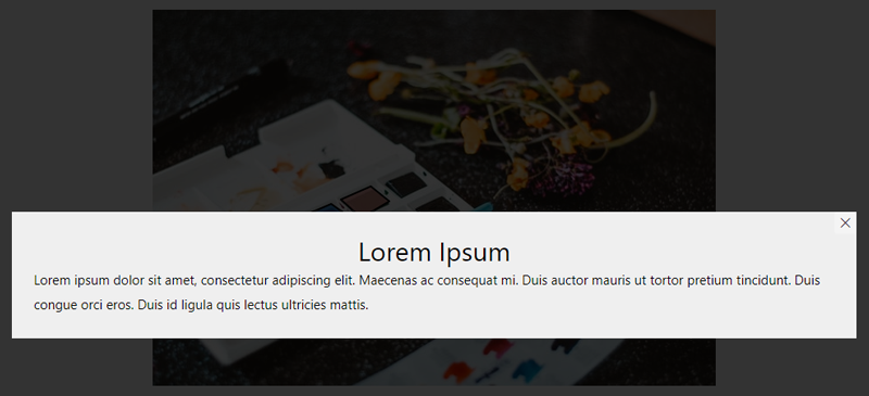
Lightbox
The hotspot’s Title and More information box will display in a lightbox pop-up that appears when clicking a hotspot within the Draw Attention image.
Tooltip
The hotspot’s information will appear as a tooltip when hovering over a hotspot or clicking one within the Draw Attention image.
Show More Info On…
This neat setting allows you to change the trigger that fires the hotspot’s action. Currently these are the following triggers:
- Click – When a user clicks the hotspot, an action occurs.
- Hover – When a user hovers over the hotspot, the hotspot’s information will appear.
We will note that it is not recommended to use the Tooltip layout and Hover setting if you have added links to the hotspot’s More Description area. This makes it difficult for users to click the links. In this case, we would recommend using the Click setting instead.

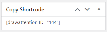
Copy Shortcode
This nifty section allows you to simply copy and paste the Draw Attention image’s shortcode so that you can show off your awesome image.
If you need a refresher on how to display the interactive images, take a look at this guide.
Related Guides
-

Start Here! Create Your First Interactive Image
-
Installing Draw Attention
-
Hands-on Interactive Image Editor
-
Feature Overview